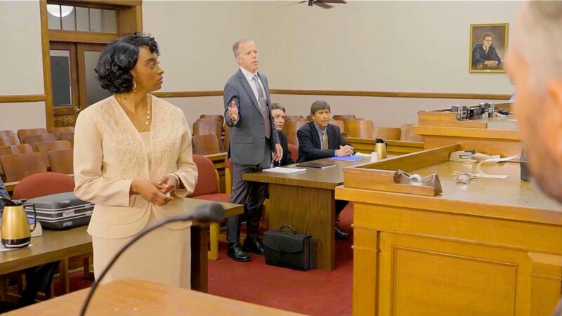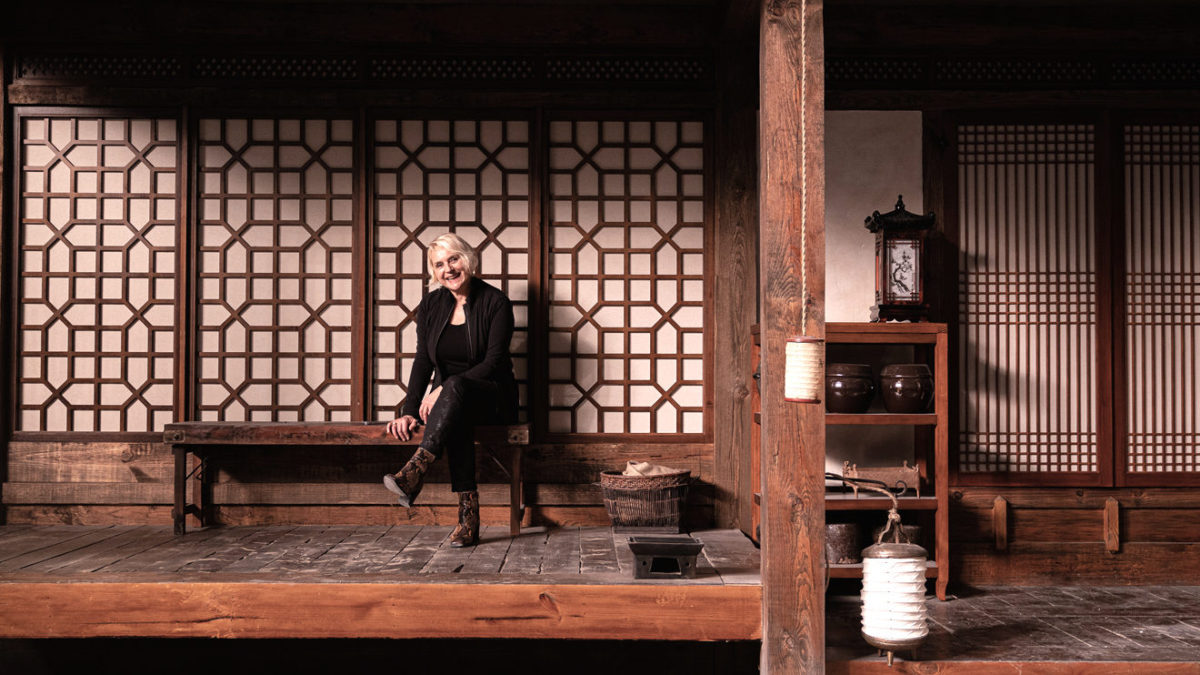
Lovecraft Country follows Atticus Freeman and Letitia. Who embark on a road trip across 1950’s Jim Crow America in search of Atticus’ missing father. We talk to Kalina Ivanov who built the world of Lovecraft Country, about her production design for the HBO Series
Kalina Ivanov was born in Bulgaria and grew up during communism, which was a very oppressive regime. In 1979 Kalina and her parents fled to New York City through Greece. Throughout Kalina’s career, she has always tried to design different genres and subject matters. “I think it goes back to my training as a theater designer,” she says.
As students at NYU TSOA/Design, we were tasked with designing operas, ballets, musicals, Shakespeare, contemporary plays, avant-garde, you name it. I made the transition from theater to film through storyboarding. To learn more about film language, I studied at NYU TSOA/Graduate Film Program. I learned how to make short films. My thesis film was nominated for a student Oscar, but I was happier as a designer. The transition from independent films to bigger studio films was gradual. I wanted to master my craft on a smaller scale first. So, I would production design beautiful independent films such as Smoke and Household Saints. Then go and storyboard large Hollywood productions from Quiz Show to Silence of the Lambs. I think it took me about 6 years to do my first major studio film, “Malcolm Lee’s” The Best Man.
indieactivity: What is your typical schedule on Lovecraft Country?
Kalina Ivanov (KI): I was hired on December 3rd, 2018. I finished shooting on January 21, 2020, so it was quite the journey. This was a very complex show, and luckily HBO gave us the proper amount of preparation.
How do you guys work? How do you collaborate on Lovecraft Country?
Kalina Ivanov (KI): I’m a very collaborative artist, and love to share all my ideas with everyone on the team. At first Misha Green, the writers and I would discuss the characters’ arcs. Then I would create a design book of images. When I came on board 8 of the scripts were fully developed. We had the outlines for the final 2 episodes. It was over 600 pages of writing, and I approached it as if I was simultaneously designing four feature films. Once Misha approved the design book, I would share it with all the artists and my team.
The backdrop of Lovecraft Country is Jim Crow America, walk us through your research and conclusions for your work? We’d love to see designs, and photographs of your sets?
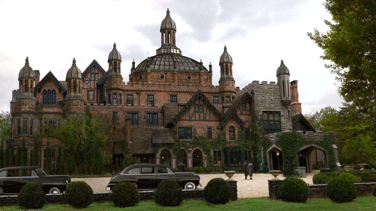
KI: Misha and the writers specifically set the first season in 1955, the year Emmett Till was brutally murdered. As a designer, I always strive for emotional and historical authenticity. So, bringing the 1950s to life was the foundation of the overall look. I felt that it was important to root all the characters in the reality of Jim Crow America. I developed specific color palettes for each of the characters, that mirrored their complex inner lives.
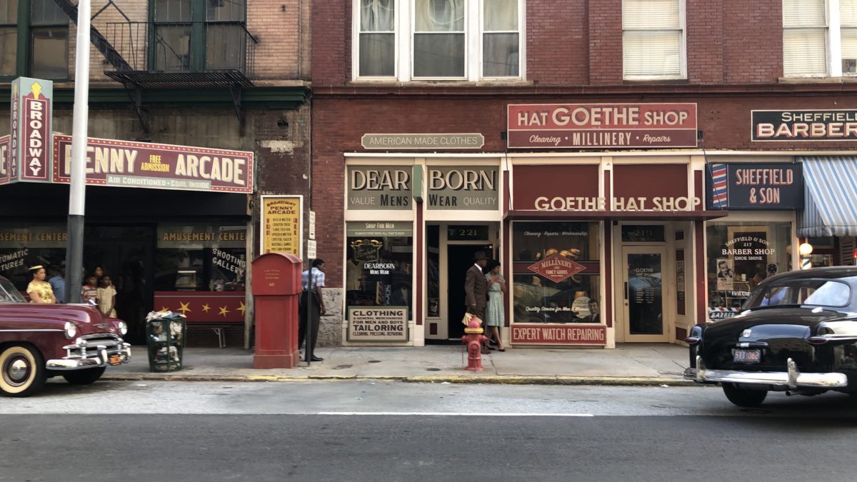
The departure point was the tremendous amount of research on Chicago and America in the 1950s. There is so much photography preserved from the period, with perhaps the most important being the work of Gordon Parks. Once that foundation was in place, I was ready. I let my imagination fly in each direction that the scripts called for. I also wanted to examine the period style with a very modern eye. Bringing complexity and richness to the past, and making it relatable to contemporary audiences.
The environments needed to brim with life so that the viewers feel seamlessly transported into each world. My team and I accomplished this by adding many layers to each set, through architecture and set decoration. My hat goes off to the entire art department. Without their support, I could never have accomplished such a challenging project.
Strong production design themes (design, sets, costumes, color palette) define each Lovecraft episode, it is all so engulfing. Dig down deep into your BTS on the episode. Say S1E4 “A History of Violence” and/or S1E6 “Meet Me in Daegu”. Show us your creative process working with your crew.
KI: Designing the Boston Museum was such a delight. Since one of my favorite places in New York City is the Museum of Natural History. Where I spent many weekends with our son. I pitched Misha Green the idea of a large statue of Titus as the portal to the hidden chambers. The original script called for a trap door in the floor. For me, Titus was like Columbus, a very bad man glorified as a hero. I wanted the statue to dominate the room. And specifically designed the crocodiles with their bare teeth flanking it to reflect the shoggoths’ mouths.
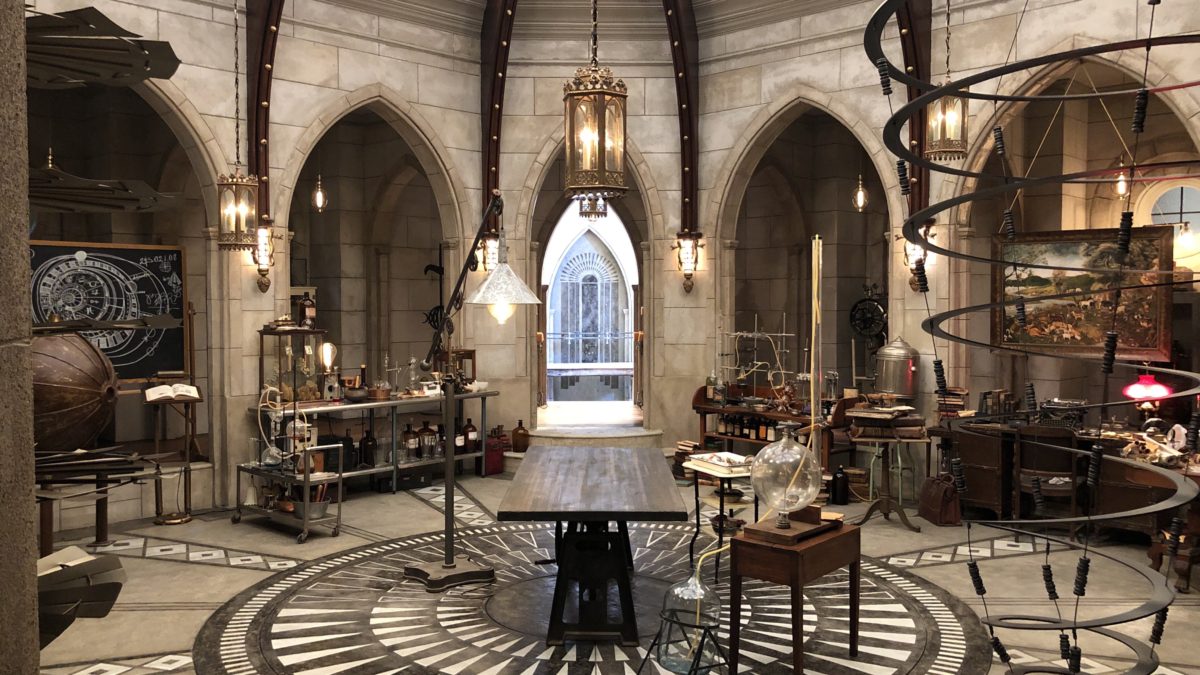
Once our protagonists enter the statue, they climb 20 feet down to Titus’ chamber. I designed the chamber as if it had been carved out of stone. As a bridge between the beautiful man-made architecture of the museum and the organic earth tunnels. Much of my inspiration for the tunnels came from the Sudwala caves in South Africa. Which are over 240 million years old, and have a very warm palette.
Creating the tunnels and figuring out how to submerge them into a large water tank was a great technical challenge. The entire art department rose to the occasion. We submerged a sample of the painted walls in water for a month. This was to make sure it wouldn’t peel and create debris. The water in the tank needed to be crystal clear so that the camera could shoot from above and below.
For the ‘puzzle’ door, I turned to Lorenzo Ghiberti’s “Gates of Paradise” as an inspiration. That was the departure point for our version of a Garden of Eden riddle. We also made the sculpted panels practical to push so that the actors could interact with them. I believe in physical scenery, so it feels authentic not only to the performers. But, also to the crew; in this way, the sets become an immersive experience for all. It worked very well on LOVECRAFT COUNTRY, and we built a massive amount of sets for each episode.
Tell us about the Lovecraft Country episode you’re most proud of?
KI: Episode 7 “I AM” is perhaps the most challenging script anyone has ever handed me. I should mention that all the scripts were ready before we started the prep work. So, Hippolyta’s journey was well mapped out in advance. Developing the different worlds she travels to was an entirely different matter, which took months of drawing and imagining. Misha gave me a carte-blanche to dream and dazzle.
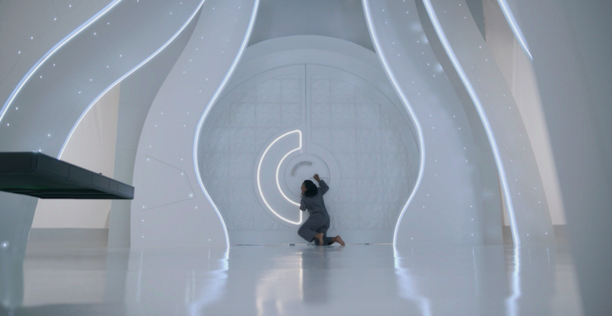
The central theme of a woman made to feel ‘small’ who finds her true self spoke to me. It spoke to me as an artist, woman, mother, and political refugee. I grew up in a drab communist country. As a teenager, I often day-dreamed about living in a world of color and joy. So I channeled that young Bulgarian dreamer to think like Hippolyta’s creative, curious and intelligent mind. The goal was for the audience to put themselves in the character’s shoes and time-travel to strange and magical places. I wanted the colors to grow more shimmering with each place that Hippolyta visited.
In this episode, I also wanted to play with the concept of a circle to best describe Hippolyta’s astronomical mind. Planets are round, and that shape became my primary template for designing “IAM”. In addition, I spoke at length with the writers about Afrofuturism. And Sun Ra’s SPACE IS THE PLACE, which had a huge influence on all of us. Going back to the central idea of a circle design, it starts with the Kansas observatory. Misha and I settled on the 1930s Art Deco architecture for it. I designed the floor to look like a sky with stars, to both bring the universe inside and to foreshadow the time-travel sequence.
The next circular set was The WHITE ROOM on Planet 504. Where Hippolyta wakes up naked and later meets the eight-foot-tall Beyond C’Est. I originally looked at African braids as inspiration for the room and the planet. My preliminary sketches play with the whimsy of braid styles in an effort to capture Hippolyta’s mind. From there we developed the room into a glowing elegant place with star-like lights embedded in the twisted columns. It’s supposed to be a prison cell 200 years in the future. So, an observant eye would notice that the floating building on Planet 504 looks like a warped cool sphere with prison bars.
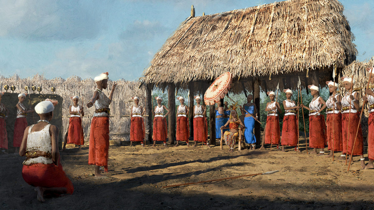
Another circular set is the Kingdom of Dahomey’s FIGHTING PIT where Hippolyta trains to be a supreme warrior. I also incorporated circles into the design of the rocket ship. Which lands on Planet NELUS, as well as the aliens greeting it. When I was designing the planets, I looked at the 1950s sci-fi book covers and films. I did so through the prism of our modern eyes and sensibilities. I wanted them to feel both nostalgic and fresh at the same time. You can say that this entire project has been a magical gift. I feel very privileged to have been a part of it and to channel Hippolyta’s journey.
How do you keep track of work so that it gets done on time?
KI: I’m actually a big day-dreamer, so I have a team of art directors helping me navigate time and schedule.
What is your greatest weakness? What major challenges do you face in Lovecraft Country?
KI: My biggest weakness is that I love to draw, and need time alone for it. However, on a TV show with so many large scale sets. I’m constantly interrupted by meetings or questions. So it’s really hard to focus on the creative drawings. I asked our graphic artists to make me a sign with “STAY AWAY, KALINA IS DRAWING” on it. I hung it on my office door. It only worked sometimes. So, I would end up staying late after everyone left the office, to have some quiet design time.
You donned several hats on projects, it requires intellect, effort, tenacity, skill. What did it take you to put on these qualities to get your job done? Did this work ethic come from your experience in independent filmmaking?
KI: I would say that tenacity and effort come from me being a political refugee. I could never go back to my old country. So, I had to figure out how to succeed in the USA. I love independent films, and the main lesson they teach you is perseverance and love for fellow artists.
Can you breakdown the work process (managing your department) of a production designer?
KI: On a typical film or television show I have an art director, a team of set designers, 2 graphic artists, a set decorator with a team, a construction coordinator, and scenic charge with their teams, a prop master, and a VFX supervisor. All these people work together to bring the production design to life. It’s a big job, which is why one has to hire people who share a passion for filmmaking.
Finally, What advice would you give the next generation daydreaming about following in your footsteps?
KI: NEVER GIVE UP.
Kalina Ivanov is a noted film and TV Production Designer. She earned an Emmy Award and Art Director’s Guild award for her work on the HBO Production, Grey Gardens. Starring Jessica Lange and Drew Barrymore, directed by Michael Sucsy.
Tell us what you think of the interview with Kalina Ivanov What do you think of it? What ideas did you get? Do you have any suggestions? Or did it help you? Let’s have your comments below and/or on Facebook or Instagram! Or join me on Twitter.
Kalina Ivanov Socials
Website
IMDb
Twitter
Instagram
MORE STORIES FOR YOU
Richard Green Documentary, ‘I Know Catherine, The Log Lady’: Premiere in NYC, LA May 9th
Lynchian Doc I Know Catherine, The Log Lady Makes Hollywood Premiere 4/17, Rollout to Follow
In Camera by Naqqash Khlalid Launch on VOD April 29
Naqqash Khlalid’s Directs Nabhan Rizwan. In Camera stars an EE BAFTA Rising Star Award Nominee.
2025 Philip K. Dick Sci-Fi Film Festival Award Winners Announced
Vanessa Ly’s Memories of the Future Awarded Best PKD Feature
Dreaming of You by Jack McCafferty Debuts VOD & DVD for April Release
Freestyle Acquires “Dreaming of You” for April 15th Release
Hello Stranger by Paul Raschid set for London Games Festival & BIFFF
The film Is set for an April 10th Premiere at The Genesis Cinema in London (LGF) and BIFFF
Daydreamers Official Trailer by Timothy Linh Bui: Released by Dark Star Pictures
Daydreamers Vietnamese Vampire Thriller – May 2nd release


